

Nuxt Icon is a module that allows Nuxt developers to directly access hundreds of thousands of everyday icons within their app components. It presents a fast, elegant, and performant-friendly way to add icons to our app’s components. The module greatly simplifies the developer experience of working with icons by giving instant access to icons in a simple way rather than manually downloading SVG icons and adding them to your app.
Nuxt Icon pulls its icons from Iconify’s API which is an open-source repository for icons in general. This allows us to access a large number of icons that are constantly increasing based on the open-source contributions.
Installation
Run this command in the terminal to install Nuxt-Icon with npm :
npm install --save-dev nuxt-icon
If you’re using yarn, make sure to run this instead:
yarn add --dev nuxt-icon
Next, we’ll have to add nuxt-icon to our nuxt.config.ts file to initialize it within our app.
import { defineNuxtConfig } from 'nuxt'
export default defineNuxtConfig({
  modules: ['nuxt-icon']
})
Usage
To use the icons in our app, we’d have to use the <Icon/> component. This component has three main props: name, color, and size.
- The
nameprop represents the icon’s name. You can find the name of your intended icon inside iconify’s site. - We use
colorto define the literal color of the icon. sizedescribes the height and width of the icon
After installing Nuxt-Icon you can use it by just adding the <Icon/> component. You now add the props above to the component to display the correct icon.
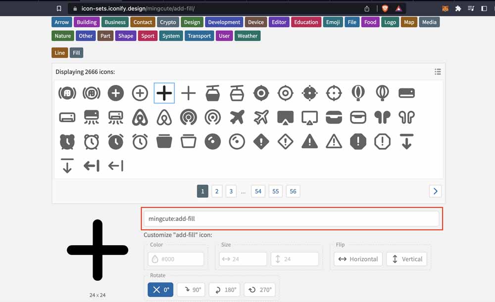
For example, here we add the name and color props to the <Icon/> component.
<Icon name="mingcute:add-fill" color="black" />
You can also convert an emoji into an SVG icon by using the emoji as the icon’s name
<Icon name="🚀" />
Custom Icon
Finally, we can use a custom icon within our app. It just has to be within the components/global/ folder.
For example, we have a custom icon called CustomIcon.
<Icon name="CustomIcon" />
In this case, CustomIcon is imported from components/global/CustomIcon.vue
// CustomIcon.vue

<template>
  <svg width="47.63" height="32" viewBox="0 0 256 172"><path fill="#80EEC0" d="M112.973 9.25c-7.172-12.333-25.104-12.333-32.277 0L2.524 143.66c-7.172 12.333 1.794 27.749 16.14 27.749h61.024c-6.13-5.357-8.4-14.625-3.76-22.576L135.13 47.348L112.973 9.25Z" /><path fill="#00DC82" d="M162.505 38.733c5.936-10.09 20.776-10.09 26.712 0l64.694 109.971c5.936 10.091-1.484 22.705-13.357 22.705H111.167c-11.872 0-19.292-12.614-13.356-22.705l64.694-109.971Z" /></svg>
</template>
Config
We can create a configuration in our app for Nuxt-Icon. This config is a set of rules for the default state of our <Icon/> and its props. This can be helpful when building a large project where you need to abstract certain parts of the component to make sure there’s not a lot of repetition, allowing you to stick to the DRY (Don’t Repeat Yourself) principle.
Now, let’s define a single configuration that’s applicable everywhere in our app. To do that, create an app.config.ts file at the root of the project and set up nuxtIcon.
export default defineAppConfig({
  nuxtIcon: {
    size: '20px',
    class: 'app-icon',
    aliases: {
      'mLogo': 'logos:medium',
    }
  }
})
In the config above, we’re defining the size of all <Icon> components in our app as 20px and setting the CSS class to app-icon. The aliases object allows us to assign a name to the actual icon name as mentioned earlier; usually a simpler and intuitive name. In the config above, we’re replacing logos:medium with mLogo.
Please note that without writing a custom config, the default size of all <Icon> will remain 1em and the default class, icon.
An additional object you can add to the config file is iconifyApiOptions. It contains a property called url which is only useful if you have a self-hosted version of iconify; you can add the URL endpoint of your version. In this case, you can also add a publicApiFallback property that’s a boolean to determine whether to fall back to the public Iconify API if the self-hosted API doesn’t work. This fallback only works for the <Icon> component, not for the <IconCSS> component (we’ll discuss what the <IconCSS> component is in a bit).
export default defineAppConfig({
  nuxtIcon: {
    // ...
    iconifyApiOptions: {
      url: 'https://<your-api-url>',
      publicApiFallback: true
    }
  }
})
You can find more details about the config and all its available properties here.
Render Function
You can display an <Icon> in your Nuxt component using the render function. First, you import it like this:
import { Icon } from '#components'
Then assign it to a variable called CustomIcon. Keep in mind that while assigning it to a variable, we have to define the props. The name prop is defined as logos:medium and color is defined as black.
const CustomIcon = h(Icon, { name: 'logos:medium', color: 'black' })
Go ahead to use it as a component within our app’s component as <CustomIcon />.
<script setup>
import { Icon } from '#components'

const CustomIcon = h(Icon, { name: 'logos:medium', color: 'black' })
</script>

<template>
  <p><CustomIcon /></p>
</template>
Let’s go back to what <IconCSS/> is. It uses the icon as a mask-image and uses <span/> to eventually render the icon on your browser. It’s mostly for performance reasons than anything because besides the component name, every other thing is the same.
<template>
  <IconCSS name="logos:medium" />
</template>
P.S: <IconCSS/> is currently experimental with Nuxt UI and is constantly changing.
Now that we’ve gone through Nuxt Icon and how to use it within our regular applications, let’s now replicate Medium’s onboarding screen using Nuxt Icon.
Building Our Onboarding Screen
Now that we’ve been introduced to Nuxt Icon and its properties, it’s time to put it into practice by building with it. Let’s take a look at what we’ll be building.
Our demo app is the onboarding screen for Medium users. While replicating this screen, we’d be implementing all icons using Nuxt-icon. Let’s jump right in:
Installation
To get started, we’ll need to set up our Nuxt project. Run this command in your terminal:
npx nuxi@latest init nuxt-medium
Navigate into your project’s directory and initiate your project:
cd nuxt-medium

npm run dev
Now we can install Nuxt-Icon. Run this command in your terminal:
npm install --save-dev nuxt-icon

#or

yarn add --dev nuxt-icon
Register the nuxt-icon module by adding it to the modules array in your nuxt.config.ts file.
export default defineNuxtConfig({
  modules: ["nuxt-icon"],
  devtools: { enabled: true },
});
Styling and Typography
Let’s start out by adding the right fonts to the project. Go into our sample repo and download these two fonts: GT-Super-Display-Light-Trial and Sohne. Once they’ve been downloaded, create a fonts folder inside our project’s public folder and have them live there. So both font files live inside the public/fonts folder.
We’re going to be styling our project using SASS. Feel free to use plain CSS if you want
Within the root folder, create an assets folder, then create a scss folder inside of it. Now, inside the assets/scss folder, we’re going to create four stylesheet files: base.scss ( foundational styles for our HTML elements), layout.scss(page styles), main.scss (where we import all the style files), and typography.scss(our font styles).
The goal here is to add our custom font files to the stylesheet. Within our typography.scss, we add these fonts using @font-face.
// typography.scss

@font-face {
  font-family: "GT-Super-Display-Light-Trial";
  src: url("/fonts/GT-Super-Display-Light-Trial.otf") format("opentype");
  font-weight: normal;
  font-style: normal;
  font-display: swap;
}

@font-face {
  font-family: "sohne";
  src: url("/fonts/sohne.otf") format('opentype'),;
  font-weight: normal;
  font-style: normal;
  font-display: swap;
}
For base.scss file, we take a bunch of the main HTML elements and give them a default style for our project. These include setting the margin, border, and padding to 0. Then, we go on to set the default font-family to "sohne" and vertical-align is set to baseline.
We then set our default display to block; while margin-block-start and margin-block-end are set to 0.
// base.scss

html,
body,
div,
span,
applet,
object,
iframe,
h1,
h2,
h3,
h4,
h5,
h6,
p,
blockquote,
pre,
a,
abbr,
acronym,
address,
big,
cite,
code,
del,
dfn,
em,
img,
ins,
kbd,
q,
s,
samp,
small,
strike,
strong,
sub,
sup,
tt,
var,
b,
u,
i,
center,
dl,
dt,
dd,
ol,
ul,
li,
fieldset,
form,
label,
legend,
table,
caption,
tbody,
tfoot,
thead,
tr,
th,
td,
article,
aside,
canvas,
details,
embed,
figure,
figcaption,
footer,
header,
hgroup,
menu,
nav,
output,
ruby,
section,
summary,
time,
mark,
audio,
video {
  margin: 0;
  padding: 0;
  border: 0;
  box-sizing: border-box;
  font-family: "sohne", Courier, monospace;
  vertical-align: baseline;
  margin-block-start: 0;
  margin-block-end: 0;
  display: block;
}
For the html, set your font-size to 62.5% because we’re using rem to represent font-size instead of px. So, the logic is that the root font size of our browsers is 16px, and we want to make it possible to convert our px to rem in tens. So, we calculate the percentage of 10px out of 16px as 62.5%.
Technically, this means that 10px = 1rem everywhere in our app. For instance a font-size of 14px can be defined as 1.4rem.
html {
  /* 62.5% of 16px browser font size is 10px */
  font-size: 62.5%;
}

.some-element {
  /* 1.4 * 10px = 14px */
  font-size: 1.4rem;
}
Read more about this concept here.
Furthermore, there’s a media-query block for max-width: 600px, where we define our font-size as 55%.
html {
  font-size: 62.5%;
  @media screen and (max-width: 600px) {
    font-size: 55%;
  }
}
For button, we’re defining the styles as none. The goal is set all default styling, from text-decoration, -webkit-appearance, and outline to none. We’re doing this so we can customize our buttons as we want.
button {
  text-decoration: none;
  -webkit-appearance: none;
  outline: none;
}
Finally, we have ::-webkit-scrollbar where we hide our scroll-bar with display: none.
::-webkit-scrollbar {
  display: none;
}
// main.scss

@import "typography.scss";
@import "layout.scss";
@import "base.scss";
Inside main.scss, we simply import our scss files. This allows us to export a single scss file into our nuxt.config.ts file.
// nuxt.config.ts

export default defineNuxtConfig({
  modules: ["nuxt-icon"],
  css: ["~/assets/scss/main.scss"],
  devtools: { enabled: true },
});
Within our nuxt.config.ts, we add a css property and link our main.scss file with ["~/assets/scss/main.scss"].
Layout
Next, we define our app’s layout. Go into your app.vue and create a parent div
with the CSS class .wrapper. This is going to act as a container for our app display.
// app.vue

<template>
  <div class="wrapper">

  </div>
</template>
Now, let’s go into our layout.scss file in scss/layout.scss and style our .wrapper class. We’ll set the display to grid and set its content to the center with justify-content: center.
.wrapper {
  display: grid;
  justify-content: center;
}
Header
Now, to the exciting part. Let’s create another div inside of the .wrapper div and add a class called .wrapper__inner.
<template>
  <div class="wrapper">
    <div class="wrapper__inner">

    </div>
  </div>
</template>
Similarly, we’ll add the SCSS styles for this new div in layout.scss. Let’s define its display as grid and font-family as GT-Super-Display-Light-Trial.
.wrapper {
  ...
  &__inner {
    display: grid;
    font-family: "GT-Super-Display-Light-Trial", Courier, monospace;
  }
}
Now, we can add our <Icon/> component inside the div. Let’s call its class name wrapper__inner__icon, and its props include name, width, height, and color.
The name of the Icon is logos:medium, the width is 7em, height is 2.5em, and color is black.
<template>
  <div class="wrapper">
    <div class="wrapper__inner">
      <Icon
        class="wrapper__inner__icon"
        name="logos:medium"
        width="7em"
        height="2.5em"
        color="black"
      />
    </div>
  </div>
</template>
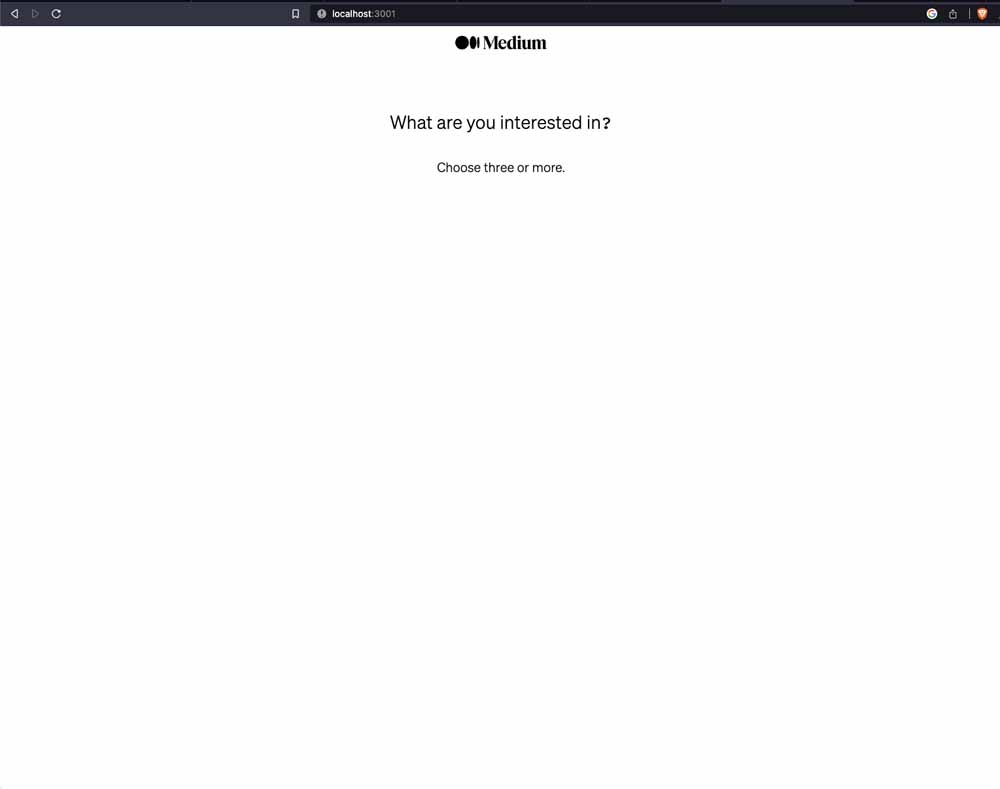
Directly beneath the <Icon/>, we can add the necessary text for the title of the onboarding page and its description.
<template>
  <div class="wrapper">
    <div class="wrapper__inner">
      <Icon
        class="wrapper__inner__icon"
        name="logos:medium"
        width="7em"
        height="2.5em"
        color="black"
      />
      <h3 class="wrapper__inner__title">What are you interested in?</h3>
      <p class="wrapper__inner__select">Choose three or more.</p>
    </div>
  </div>
</template>
Firstly, we’d give a general style to wrapper__inner__icon and wrapper__inner__select. We’ll set justify-self for each of them to center and font-size to 2rem.
.wrapper {
  display: grid;
  justify-content: center;
  &__inner {
    display: grid;
    font-family: "GT-Super-Display-Light-Trial", Courier, monospace;
    &__icon,
    &__select {
      justify-self: center;
      font-size: 2rem;
    }
    &__title {
      margin-top: 8rem;
      justify-self: center;
      margin-bottom: 4rem;
      font-size: 2.8rem;
      line-height: 3.2rem;
      font-weight: 400;
    }
  }
}
For wrapper__inner__title, we’d set it’s margin-top to 8rem, margin-bottom to 4rem, and justify it to the center. For the font-size, it’ll be slightly more prominent than the icon at 2.8rem, line-height is set at 3.2rem, and font-weight at 400.
Let’s run our app’s development server
#yarn
yarn dev

#npm
npm run dev
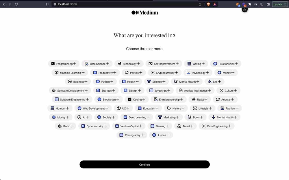
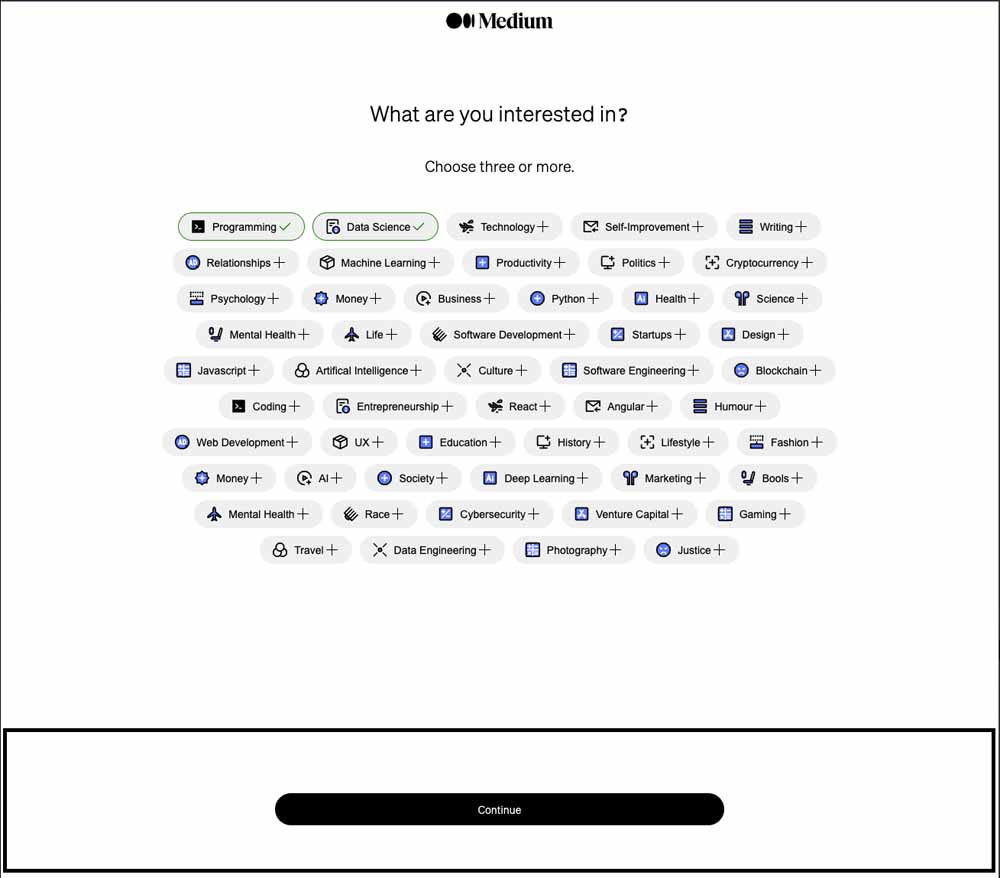
We should see our app displayed in our browser:
Options List (Categories)
Next, we’ll be displaying our list of categories for users to select while onboarding.

Let’s create a new div for this section. We’ll give the div a class of wrapper__options
<div class="wrapper__options">

</div>
Now, let’s add styles for our .wrapper__options. Set the display to flex, width to 70%, and wrap the div’s content using flex-wrap: wrap.
Next, let’s add a margin of 4.8rem auto 13vh auto. This helps us to set div in the middle and add some margin on top and below.
To enable scrolling, we’ll add overflow: auto, define the gap between the div items as 1rem, and justify-content: center.
.wrapper {
  display: grid;
  justify-content: center;
  &__inner {
    ...
  }
  &__options {
    display: flex;
		width: 70%;
		flex-wrap: wrap;
    margin: 4.8rem auto 13vh auto;
    justify-content: center;
    gap: 1rem;
    overflow: auto;
    @media (max-height: 800px) {
      height: 60vh;
    }
  }
  &__footer {
    ...
  }
}
For the content, let’s loop over each option. The list of options we want to display are topic categories for preferred articles on Medium. Within the root folder, create a new folder called data and add the file item-list.js. Copy and paste the file’s content from here.
// data/item-list.js

export const categories = [  {    id: 1,    icon: "ant-design:code-filled",    name: "Programming",  },	{	...	}]
Individual item in the categories array contains an id, the icon’s name, and the display name for each item.
Let’s import the categories array into app.vue and loop over its items. We’d be using v-for to loop over it with v-for="category in categories", and define the :key prop with category.id.
<script setup>
import { categories } from "/data/items-list.js";
</script>

<div class="wrapper__options">
  <div :key="category.id" v-for="category in categories">
    <OptionButton :category="category" />
  </div>
</div>
We’re creating a new component to loop over called: <OptionButton :category="category" />. This component with be inside our components folder as components/OptionButton.vue.
Within the component, we define the props. In this case, we use defineProps to define the category prop; its type is an Object and it’s required.
Next, we’d want to change the UI of the button when a user clicks and selects a category. To do this, let’s create a reactive variable called toggleUser to track this behaviour.
// OptionButton.vue

<script setup>
import { ref } from "vue";
const props = defineProps({
  category: {
    type: Object,
    required: true,
  },
});
const { category } = props;
const toggleUser = ref(false);
</script>
This entire component is a <button/>. Directly on the <button/> we have the @click event to change the style when it’s clicked. In our case, once it’s clicked we want to change the boolean value for toggleUser. We also add dynamic classes that takes effect based on boolean value.
Technically, anytime toggleUser is true, .wrapper__options__button__active style is added to the <button/>. All it does is change the border’s color to green when clicked.
The first <Icon/> in the button is the avi that displays the icon property that we’re passing into it through the category prop. We’ll set the :name prop to category.icon, size to 1.5em, and class is wrapper__options__button__avi. Then, we’ll display the category.name.
Next, we have two icons: the plus icon (clarity:plus-line)and check (iconamoon:check-light) icon. Let’s use v-if to display the plus icon when toggleUser is false and vice-versa with the check icon.
<template>
  <button
    @click="toggleUser = !toggleUser"
    :class="[
      toggleUser && 'wrapper__options__button__active',
      'wrapper__options__button',
    ]"
  >
    <Icon
      size="1.5em"
      class="wrapper__options__button__avi"
      :name="category.icon"
    />
    {{ category.name }}
    <Icon
      v-if="!toggleUser"
      size="1.5em"
      name="clarity:plus-line"
    />

    <Icon
      v-else
      size="1.5em"
      name="iconamoon:check-light"
      color="green"
    />
  </button>
</template>
For the styles, .wrapper__options__button has a transparent border and the border-radius is 9.9rem. We also add other styles like setting the display to flex, aligning the items to the center, adding the appropriate font-size, and padding.
.wrapper {
  &__options {
    ...
    &__button {
      border: 1px solid transparent;
      border-radius: 9.9rem;
      display: flex;
      align-items: center;
      font-size: 1.4rem;
      padding: 0.7rem 1.5rem;
      &__icon {
        margin-left: 0.8rem;
      }

      &__avi {
        margin-right: 0.8rem;
      }
      &__active {
        border: 1px solid green;
      }
    }
  }
  ...
}
.wrapper__options__button__icon and .wrapper__options__button__avi both have a margin-left and margin-right of 0.8rem respectively. As mentioned earlier, .wrapper__options__button__active sets the border to the color green.
Footer
Go back into the app.vue, and inside of it, create a div at the bottom with the class .wrapper__footer with a <button/> with .wrapper__footer__button.
<template>
  <div class="wrapper">
    <div class="wrapper__inner">
      ...
    </div>
    <div class="wrapper__options">
      ...
    </div>
    <div class="wrapper__footer">
      <button class="wrapper__footer__button">Continue</button>
    </div>
  </div>
</template>
For the styles, we set the height of .wrapper__footer as 13vh, width is 100%, bottom is 0, and position is fixed. We also set the appropriate line-height to 2, text-align is center, background-color is white, font-size is 3rem, and font-weight is bold.
.wrapper {
  ...
  &__footer {
    line-height: 2;
    text-align: center;
    background-color: white;
    font-size: 3rem;
    font-weight: bold;
    position: fixed;
    bottom: 0;
    width: 100%;
    height: 13vh;
    &__button {
      font-family: "sohne", Courier, monospace;
      border: none;
      background-color: black;
      color: white;
      border-radius: 9.9rem;
      width: 45%;
      padding: 1.2rem 0;
      font-size: 1.4rem;
      margin: 1.2rem 0;
    }
  }
}
.wrapper__footer__button has a font-family of "sohne", Courier, monospace. background-color is black, color is white, and border-radius is 9.9rem.
We set the <button/>'s width to 45%, padding is set to 1.2rem 0, we have font-size: 1.4rem;, border: none, and margin is 1.2rem 0.
Wrapping Up
Congratulations on making it this far! You have successfully learned about Nuxt-Icon and how to use it in your production app. Here is the source code and the live demo to this tutorial.
If you’d like to advance your learning, check out the official Nuxt-Icon documentation.