

VueUse has a massive collection of fantastic composables.
But with so many, it can be overwhelming to look through them all.
That’s why we’ve put together this list, to showcase some of the best Vue composables that deserve some extra attention. We’ll cover what each composable does and why it’s useful. I’ve also included a live demo for each, to show them in action.
Here are the VueUse composables we’ll be covering in this article:
onClickOutsideuseFocusTrapuseHeaduseStorageuseVModeluseImageuseDark
1. onClickOutside
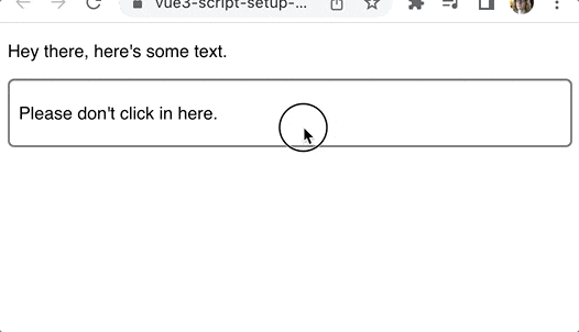
Detecting a click is pretty straightforward. But detecting when a click happens outside of an element? That’s a little trickier. Unless, of course, you’re using the onClickOutside composable from VueUse.
This is what it looks like:
<script setup>
import { ref } from 'vue'
import { onClickOutside } from '@vueuse/core'

const container = ref(null)
onClickOutside(container, () => alert('Good. Better to click outside.'))
</script>

<template>
  <div>
    <p>Hey there, here's some text.</p>
    <div class="container" ref="container">
      <p>Please don't click in here.</p>
    </div>
  </div>
</template>
We create a ref for the container element that we want to track:
const container = ref(null);
Then we turn that into a template ref with the ref attribute on the element:
<div class="container" ref="container">
  <p>Please don't click in here.</p>
</div>
Now that we have our container, we pass it to the onClickOutside composable along with a handler:
onClickOutside(
  container,
  () => alert('Good. Better to click outside.')
)
This composable is useful for managing windows or dropdowns. When the user clicks outside of the dropdown menu you can close it.
Modals also typically show this behaviour.
Check out the docs for onClickOutside here.
Go here to see the demo in action.
2. useFocusTrap
Managing focus properly is important in order to have accessible applications.
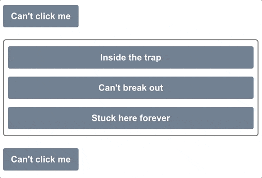
There’s nothing worse than accidentally tabbing behind a modal, and being unable to get the focus back into the modal. That’s exactly where focus traps come in.
They lock the keyboard focus to a specific DOM element. Instead of looping through the entire page, then the browser itself, your keyboard focus only loops through that DOM element.
Here’s an example of using the useFocusTrap from VueUse:
<script setup>
import { ref } from 'vue'
import { useFocusTrap } from '@vueuse/integrations/useFocusTrap'

const container = ref(null)
useFocusTrap(container, { immediate: true })
</script>

<template>
  <div>
    <button tab-index="-1">Can't click me</button>
    <div class="container" ref="container">
      <button tab-index="-1">Inside the trap</button>
      <button tab-index="-1">Can't break out</button>
      <button tab-index="-1">Stuck here forever</button>
    </div>
    <button tab-index="-1">Can't click me</button>
  </div>
</template>
With immediate set to true, the focus will be placed inside the container element as soon as the page loads. And then it’s impossible to tab outside of that container.
Once you reach the third button, hitting tab again brings you back to the first button.
Just like with onClickOutside, we first set up our template ref for the container:
const container = ref(null)
<div class="container" ref="container">
  <button tab-index="-1">Inside the trap</button>
  <button tab-index="-1">Can't break out</button>
  <button tab-index="-1">Stuck here forever</button>
</div>
Then we pass this template ref to the useFocusTrap composable:
useFocusTrap(container, { immediate: true });
The immediate option will automatically set focus to the first focusable element inside the container.
- must install
focus-trapbecause this wraps that - focus traps can be nested, automatically handles pauses and unpauses
Check out the docs for useFocusTrap here.
Go here to see the demo in action.
3. useHead
VueUse gives us an easy way to update the head section of our app — the page title, scripts, and other things that might go in there.
The useHead composable requires us to set up a plugin first:
import { createApp } from 'vue'
import { createHead } from '@vueuse/head'
import App from './App.vue'

const app = createApp(App)
const head = createHead()

app.use(head)
app.mount('#app')
Once we’re using the plugin, we can update the head section however we want. In this example, we’ll inject some custom styles on a button press:
<script setup>
import { ref } from 'vue'
import { useHead } from '@vueuse/head'
const styles = ref('')
useHead({
// Inject a style tag into the head
style: [{ children: styles }],
})
const injectStyles = () => {
styles.value = 'button { background: red }'
}
</script>
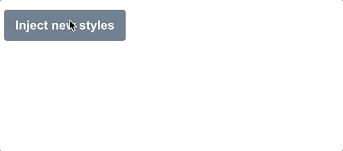
<template>
<div>
<button @click="injectStyles">Inject new styles</button>
</div>
</template>
First, we create a ref to represent the styles we’ll be injecting. We’ll leave this empty for now:
const styles = ref('');
Second, we’ll set up useHead to inject the styles into the page:
useHead({
  // Inject a style tag into the head
  style: [{ children: styles }],
})
Then we add the method that will inject these styles:
const injectStyles = () => {
  styles.value = 'button { background: red }'
}
All we’re doing here is updating the value of our styles ref. But reactivity is wonderful, and useHead will automatically update the styles that are injected every time this value changes.
Of course, we aren’t limited to injecting styles. We can add any of these to our <head>:
- title
- meta tags
- link tags
- base tag
- style tags
- script tags
- html attributes
- body attributes
Check out the docs for useHead here.
Go see the demo in action here.
4. useStorage
The useStorage composable is really cool, because it will automatically sync your ref to local storage.
Here’s a basic example:
<script setup>
import { useStorage } from '@vueuse/core'
const input = useStorage('unique-key', 'Hello, world!')
</script>

<template>
  <div>
    <input v-model="input" />
  </div>
</template>
When you first load the app, the input will display “Hello, world!”. But after that it will show the last thing that you typed into it, because it’s saved to local storage.
This composable also works with session storage:
const input = useStorage('unique-key', 'Hello, world!', sessionStorage)
You can actually provide any storage system you want, as long as it implements the StorageLike interface:
export interface StorageLike {
  getItem(key: string): string | null
  setItem(key: string, value: string): void
  removeItem(key: string): void
}
Check out the docs for useStorage here.
Go see the demo in action here.
5. useVModel
The v-model directive is some nice syntactic sugar that makes two-way data binding easier.
But the useVModel composable goes a step further, and gets rid of a bunch of boiler-plate code that no one really wants to write:
<script setup>
import { useVModel } from '@vueuse/core'

const props = defineProps({
  count: Number,
})
const emit = defineEmits(['update:count'])

const count = useVModel(props, 'count', emit)
</script>

<template>
  <div>
    <button @click="count = count - 1">-</button>
    <button @click="count = 0">Reset to 0</button>
    <button @click="count = count + 1">+</button>
  </div>
</template>
In this example, we first define the prop we want to attach to the v-model:
const props = defineProps({
  count: Number,
})
Then we emit an event that uses the v-model naming convention of update:<propName>:
const emit = defineEmits(['update:count'])
Now we can use the useVModel composable to bind the prop and event to a ref:
const count = useVModel(props, 'count', emit)
This count ref will change whenever the prop changes. But whenever it’s changed from this component, it will emit the update:count event to trigger the update through the v-model directive.
We can use this Input component like this:
<script setup>
import { ref } from 'vue'
import Input from './components/Input.vue'

const count = ref(50)
</script>

<template>
  <div>
    <Input v-model:count="count" />
    {{ count }}
  </div>
</template>
The count ref here is synced to the count ref inside of the Input component through the v-model binding.
Check out the docs for useVModel here.
Go see the demo in action here.
6. useImage

Images in web apps are getting a lot fancier over time. We’ve got responsive images with srcset, progressive loading libraries, and libraries that will only load an image once it scrolls into the viewport.
But did you know we can also access loading and error states on the image itself?
I’ve done this before by listening to the onload and onerror events that every HTML element emits, but VueUse gives us a simpler way with the useImage composable:
<script setup>
import { useImage } from '@vueuse/core'

// Change this to a non-existent URL to see the error state
const url = 'https://source.unsplash.com/random/400x300'
const { isLoading, error } = useImage(
  {
    src: url,
  },
  {
    // Just to show the loading effect more clearly
    delay: 2000,
  }
)
</script>

<template>
  <div>
    <div v-if="isLoading" class="loading gradient"></div>
    <div v-else-if="error">Couldn't load the image :(</div>
    <img v-else :src="url" />
  </div>
</template>
First, we set up the composable with our image URL:
const { isLoading, error } = useImage({ src: url })
We’ll grab the isLoading and error refs that it returns so we can track the state. This composable uses useAsyncState internally, so the values it returns are the same as that composable.
Once we do that, useImage loads our image and attaches event handlers to it.
All we need to do is use that image in our template by using the same URL. Since the browser will reuse any cached image, it will reuse the one loaded by useImage:
<template>
  <div>
    <div v-if="isLoading" class="loading gradient"></div>
    <div v-else-if="error">Couldn't load the image :(</div>
    <img v-else :src="url" />
  </div>
</template>
Here, we set up a basic loading and error state handler. While the image is loading we show a placeholder with an animated gradient. If there’s an error, we display an error message. Otherwise we can render the image.
I want to re-iterate this point though: because the image is already loaded by useImage, as soon as that img tag is added to the DOM, it will render the image.
This composable has some other great features, too! If you want to make it a responsive image, it has support for the srcset and sizes attributes, which are passed along to the img element behind the scenes.
There is also a renderless component if you prefer to keep everything inside of your template. It works in the same as the composable does:
<template>
	<UseImage src="https://source.unsplash.com/random/401x301">
    <template #loading>
			<div class="loading gradient"></div>
		</template>
    <template #error>
			Oops!
		</template>
  </UseImage>
</template>
Check out the docs for useImage here.
Go see the demo in action here.
7. Dark mode with useDark
Every website and app seems to have dark mode these days.
The hard part is the styling changes. But once you’ve got that, toggling back and forth is pretty straightforward.
If you’re using Tailwind, you only need to add the dark class to the html element to enable it for the whole page:
<html class="dark"><!-- ... --></html>
However, there are a few things to consider when toggling between dark mode and light mode. First, we want to take the user’s system settings into account. Second, we want to remember if they’ve overridden that choice.
The useDark composable from VueUse wraps up all of these things together for us.
By default it looks to the system settings, but any changes are persisted to localStorage so the settings are remembered:
<script setup>
import { useDark, useToggle } from '@vueuse/core'
const isDark = useDark()
const toggleDark = useToggle(isDark)
</script>
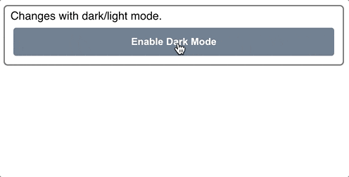
<template>
<div class="container">
Changes with dark/light mode.
<button @click="toggleDark()">
Enable {{ isDark ? 'Light' : 'Dark' }} Mode
</button>
</div>
</template>
We’ll also include these dark mode styles:
.dark .container {
  background: slategrey;
  color: white;
  border-color: black;
}

.dark button {
  background: lightgrey;
  color: black;
}

.dark body {
  background: darkgrey;
}
If you’re not using Tailwind, you can completely customize how dark mode is applied by passing in an options object. Here is what the default Tailwind would look like:
const isDark = useDark({
  selector: 'html',
  attribute: 'class',
  valueDark: 'dark',
  valueLight: '',
})
You can also provide an onChanged handler so you can write whatever Javascript you need. These two methods allow you to make it work with whatever styling system you already have.
Check out the docs for useDark here.
Go see the demo in action here.
Wrapping Up
VueUse has an immense library of fantastic composables, and we only covered a fraction of them here. I highly recommend taking some time to explore the docs and see all of the things that are available. It’s a fantastic resource, and will save you from lots of boiler-plate code and re-inventing the wheel constantly. And while VueUse is a great library, there are plenty of times you’ll want to create your own composables. Do you know how? We walk you through it in Vue Mastery’s Coding Better Composables course.