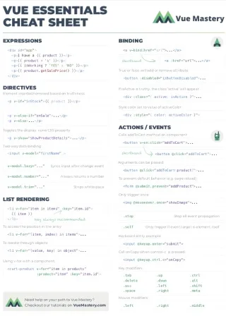


In the past few years, utility-first CSS has been a popular trend within the front-end landscape. You might have seen it mentioned alongside a tool called Tailwind CSS.
So what is “utility”?
What problem does this utility-first approach solve?
How does Tailwind fit into this?
And most importantly: how do you apply Tailwind in a Vue.js application?
We’re going to answer all of that in this tutorial. And if you prefer watching videos, you can check out the Utility-First CSS with Tailwind course from Vue Mastery. (The first three lessons in that course correspond to the content of this article.)
What is Utility-first CSS?
Let’s start off with some classic CSS/HTML code for demonstration:
CSS
.container {
  background-color: lightgray;
  padding: 20px;
  width: 500px;
  margin: 20px;
}

.heading {
  font-size: 20px;
  font-family: Arial;
  margin: 0;
}
HTML
<div class="container">
  <h1 class="heading">Utility-first CSS?</h1>
</div>
With the utility-first approach, the above could be refactored into something like this:
CSS
.bg-light-gray { background-color: lightgray; }
.p-20px { padding: 20px; }
.w-500px { width: 500px; }
.m-20px { margin: 20px; }
.font-20px { font-size: 20px; }
.arial { font-family: Arial; }
.m-0 { margin: 0; }
HTML
<div class="bg-light-gray p-20px w-500px m-20px">
  <h1 class="font-20px arial m-0">Utility-first CSS?</h1>
</div>
As you can see, it’s simply replacing the high-level classes, such as container and heading, with the low-level classes, such as bg-light-gray and p-20px.
These low-level classes are called utility classes. You can think of them as low-level design commodities with predictable names. That’s why they’re also called atomic classes.
Without looking at the the definition of h-200px, you already know it’s probably something like this:
.h-200px {
  height: 200px
}
You will never need to modify a utility class. If you need to change the look and feel of your app, you simply just change it in the HTML by adding/removing utility classes.
For example, if I no longer need a background color, I would just simply remove the bg-light-gray class like this:
<div class="p-20px w-500px m-20px">
  <h1 class="font-20px arial m-0">Utility-first CSS?</h1>
</div>
Whereas in the traditional setup, I would have to change the content of the container class like this:
.container {
  /* background-color: lightgray; */
  padding: 20px;
  width: 500px;
  margin: 20px;
}
At first, this doesn’t seem like a huge difference. It’s just a matter of modifying the CSS or modifying the HTML. But this has a huge implication in terms of maintainability.
If you change by modifying the CSS, you need extra care to make sure that the change doesn’t affect anything unintended. But if you change by modifying only the HTML, you know for sure that the change is only affecting the very HTML that you modify.
The main benefit of using utility classes is simply this: you don’t have to worry about unintended consequences of adding/removing styles.
For Vue.js developers. this might not be such a big deal if you’re already using <style scoped>. But if you have plenty of CSS shared across different components, the certainty of knowing what your change will affect is still very helpful. The utility-first approach comes with a unique philosophy for code sharing that will enforce this certainty.
Okay, but why do we need Tailwind?
Notice that in the example above, we didn’t even have to use any framework. So why do we need Tailwind, or any similar framework for that matter?
First, someone has to create all of these CSS Utility classes (hundreds of them), so either you create them yourself, or you can use an existing solution with widely-adopted naming conventions.
Second, a framework provides more useful features.
For instance, you can use a dynamically-generated class with an arbitrary value like this:
<h1 class="p-[20px]">Utility-first CSS?</h1>
This class doesn’t exist by default, but it would get created dynamically by the time this code is run.
Later I’ll talk more about how this kind of dynamic class is generated. For now, just know that there are more useful features available if you’re using a framework.
Lastly, a framework can be customized with your own configuration settings. We’ll be doing exactly that in the next part of the series.
Now let’s install Tailwind and see what it’s all about.
Setting up the project
This tutorial series is in the style of learning by refactoring. So let’s first grab this sample app from GitHub:
git clone https://github.com/Code-Pop/tailwind-tutorial.git
This app doesn’t come with tailwind pre-installed, so let’s install tailwind right now:
package.json
"devDependencies": {
  "autoprefixer": "^10.4.7",
  "postcss": "^8.4.14",
  "tailwindcss": "^3.1.6",
  ...
These are all devDependencies, meaning that we don’t need them during production. All three of these packages are used for processing your CSS code.
tailwindcss is a plugin for postcss, so postcss is basically the engine that tailwind runs on. autoprefixer is another plugin for allowing you to write browser-agnostic CSS rules, and it will take care of adding the vendor prefixes. We’re not going to use autoprefixer directly, but it is a dev dependency for Tailwind.
Next, we need to add some config files for both tailwindcss and postcss. We can do that using this command:
npx tailwindcss init -p
Now we have two new files:
- tailwind.config.js
- postcss.config.js
We don’t have to change the postcss config. But in the tailwind config, we need to let Tailwind know what files to scan:
📃 tailwind.config.js
module.exports = {
  content: [
    "./src/**/*.vue",
  ],
  ...
We’re telling it to scan only the files with the .vue extension. We’ll only be using utility classes within the component files.
Lastly, we need to go to the main.css file, and add this on top of the file:
📃 src/assets/main.css
@tailwind utilities;
This will take care of importing whatever CSS tailwind generates for us into our app.
Optionally:
If you want a style reset, you can do @tailwind base; Since this app already has its own base styles, we will not be using @tailwind base. But if you’re starting out with a brand new app, it’s a good idea to use that.
You can also do @tailwind components; if you want to use the TailwindUI component library. But we’re just going to be using Tailwind CSS in this tutorial series. TailwindUI and Tailwind CSS are two related but different projects.
Now that everything has been properly set up, let’s move on to the components.
The Components
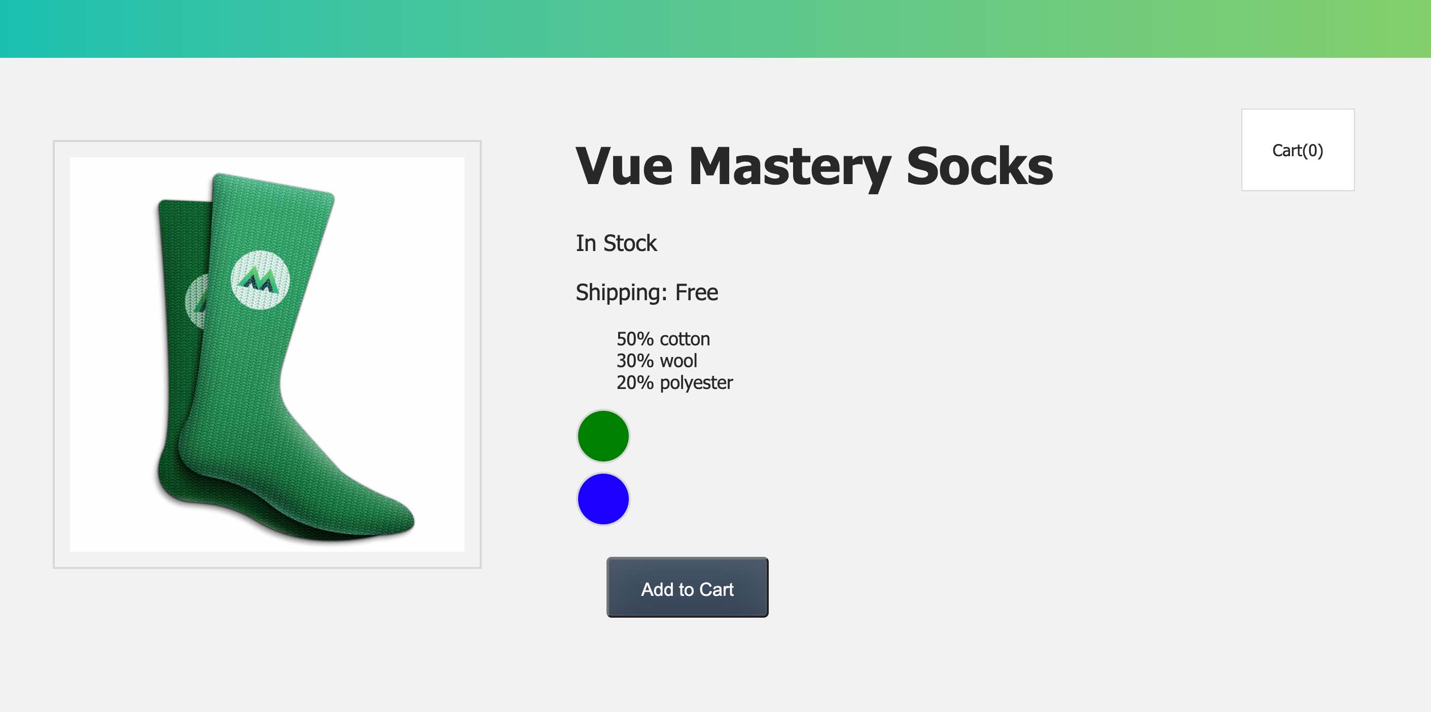
There are two components in this app: App.vue and ProductDisplay.vue.
The App component is importing and rendering the ProductDisplay component. Most of the styles are located in the ProductDisplay component.
If you run the app:
npm run dev
It looks like this in the browser:

In this tutorial, we’ll start with the simpler component, App.vue. (You can check out the Utility-First CSS with Tailwind course if you want to see the full refactoring of both App.vue and ProductDisplay.vue.)
The Refactoring
The process of the refactoring is straight-forward. We just need to swap out each one of these CSS rules with their corresponding utility classes:
📃 src/App.vue
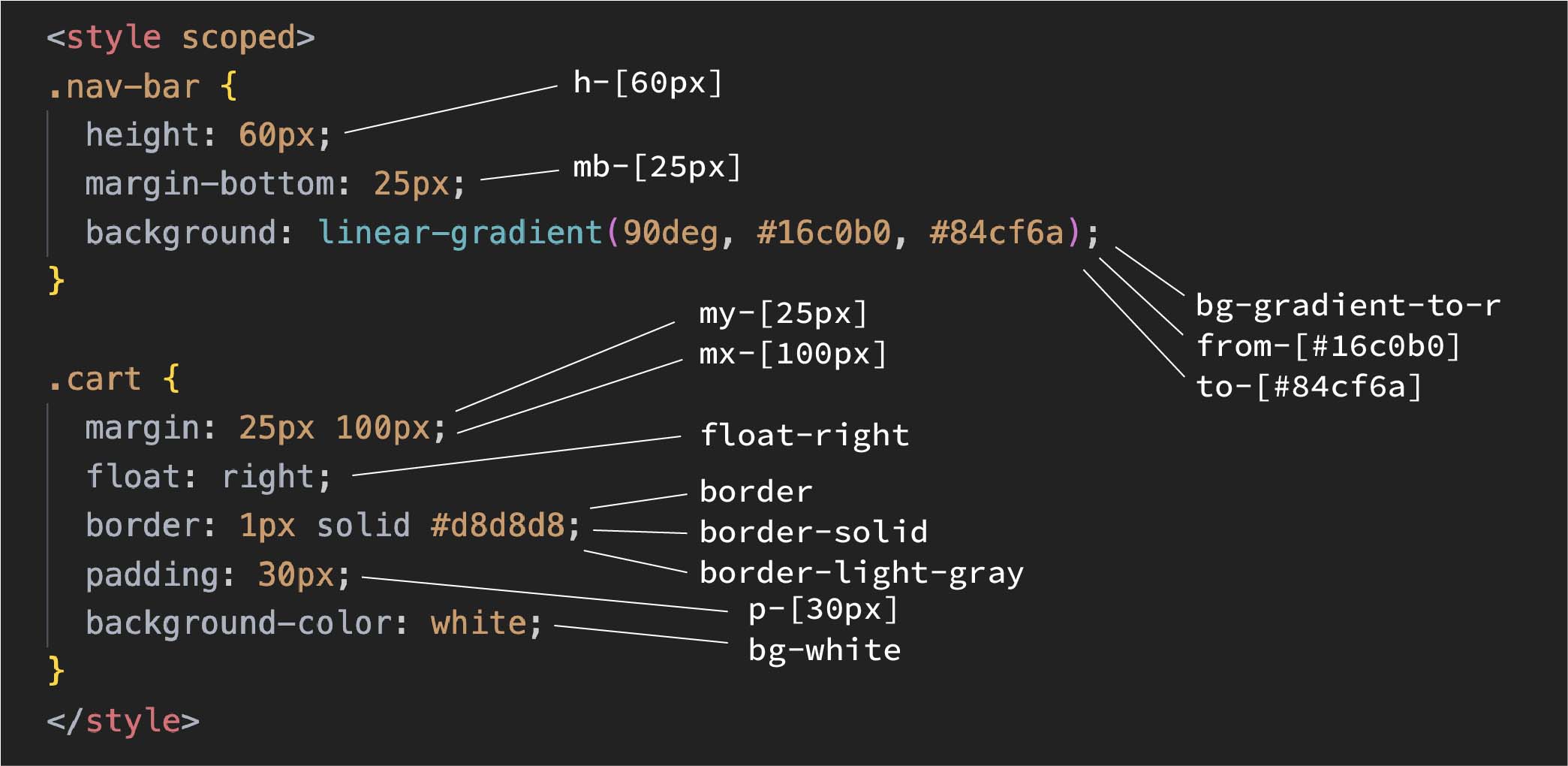
As you can see, some of the CSS rules are mapped to more than one utility class, such as the border rule and the gradient rule. So this is not always a one-to-one mapping.
Next, we put the classes inside the HTML:
📃 src/App.vue
<template>
  <div class="h-[60px] mb-[25px] bg-gradient-to-r from-[#16c0b0] to-[#84cf6a]">
  </div>
  <div class="my-[25px] mx-[100px] float-right border border-solid border-light-gray p-[30px] bg-white">
    Cart({{ cart.length }})
  </div>
  ...
Now, you can remove the original CSS:
📃 src/App.vue
<style scoped>
/*
.nav-bar {
  height: 60px;
  margin-bottom: 25px;
  background: linear-gradient(90deg, #16c0b0, #84cf6a);
}

.cart {
  margin: 25px 100px;
  padding: 30px;
  border: 1px solid #d8d8d8;
  background-color: white;
  float: right;
} */
</style>
If you check it out again in the browser, it should look exactly like before:
The Classes
Let’s go through these utility classes, one by one:
📃 src/App.vue
<template>
  <div class="h-[60px] mb-[25px] bg-gradient-to-r from-[#16c0b0] to-[#84cf6a]">
  </div>
  <div class="my-[25px] mx-[100px] p-[30px] border border-solid border-[#d8d8d8] bg-white float-right">
    Cart({{ cart.length }})
  </div>
  ...
hstands for height, soh-[60px]meansheight: 60pxmstands for margin, so mb means margin-bottom, somb-[25px]meansmargin-bottom: 25pxmystands for margins on the Y-axis, that includesmargin-topandmargin-bottommxstands for margins on the X-axis, that includesmargin-leftandmargin-right- The combo of
bg-gradient-to-r,from-[#16c0b0], andto-[84cf6a]are used for the gradient rule:background: linear-gradient(-90deg, #84cf6a, #16c0b0).to-rmeans “to right”. Alternatively, you can also useto-lfor the opposite direction of the gradient. border,border-solidandborder-[#d8d8d8]are used for the border ruleborder: 1px solid #d8d8d8;. Theborderclass meansborder-width: 1px. So, if you want a different size, you can do it withborder-2orborder-3for2pxand3pxrespectively. You can swap outborder-solidwith other classes such asborder-dashedorborder-dottedfor a different border style. We’re using a pair of brackets to specify the color of the border.bg-whiteisbackground-color: white. Alternatively, you can use your own specific color with the bracket syntax, such asbg-[#d8d8d8].- Lastly,
float-rightisfloat: right
Looking at these classes, you might be wondering: how do I know the class name for each specific situation? After all, you need to know the name of a class in order to use it.
That’s where the Tailwind documentation website comes in handy. All you need to do is to search the CSS property that you’re interested in, and it will show you the utility classes that are available for you to use.
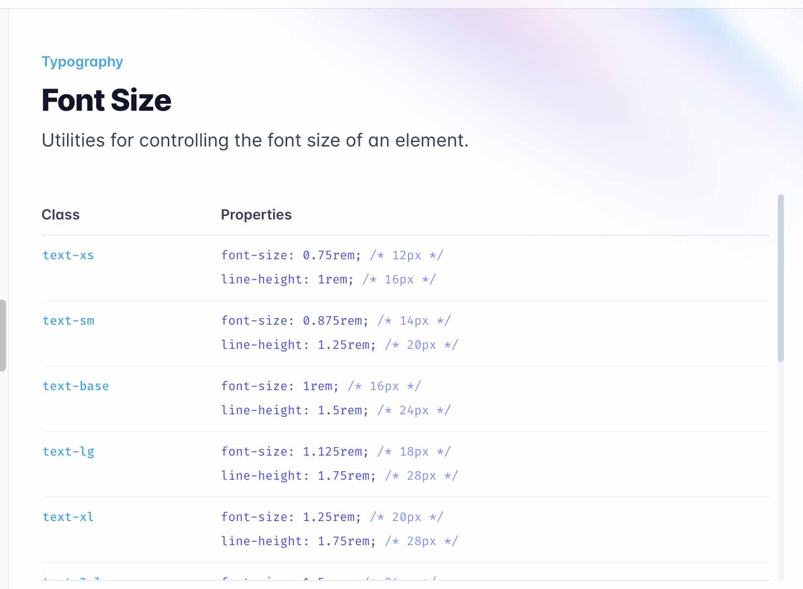
For example, if you want to set the font-size of an element, but you don’t know what class to use, just search “font-size” on the Tailwind docs:
Bracket vs No Bracket
You might have noticed that some utility classes have brackets, but some don’t.
The bracket syntax is how we’re able to specify the exact size we need. If you don’t like the verbosity of the classes, you can use the classes that Tailwind provides out of the box.
h-[60px] can be replaced with h-16, which translates to 64px.
It’s not exactly the same as 60px, but it’s fine in this case. I can also replace mb-[25px] with mb-6, my-[25px] with my-6, mx-[100px] with mx-24, and p-[30px] with p-7.
📃 src/App.vue
<template>
  <div class="h-16 mb-6 bg-gradient-to-r from-[#16c0b0] to-[#84cf6a]">
  </div>
  <div class="my-6 mx-24 p-7 border border-solid border-[#d8d8d8] bg-white float-right">
    Cart({{ cart.length }})
  </div>
  ...
Once again, these new classes aren’t the exact sizes we had originally, but they do look much cleaner.
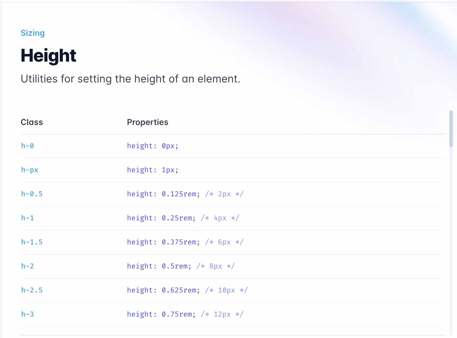
You can find more of these types of classes along with their corresponding px sizes in the documentation:
Likewise, we could replace the Hex color codes with user-friendly names that Tailwind provides out of the box, such as teal-500 and green-500:
📃 src/App.vue
<div class="h-16 mb-6 bg-gradient-to-r from-teal-500 to-green-500">
You can find the list of colors and their names in the documentation.
But the colors we need here are very specific, that’s why we’re still going to stick to the hex codes with the bracket syntax:
📃 src/App.vue
<div class="h-16 mb-6 bg-gradient-to-r from-[#16c0b0] to-[#84cf6a]">
Just In Time
As you might have noticed already, these dynamic classes don’t exist by default:
from-[#16c0b0]to-[#84cf6a]border-[#d8d8d8]
Because their names contain arbitrary values, Tailwind won’t be able to create these classes beforehand.
Instead, The Tailwind Just-In-Time (JIT) engine has to scan through our code to find these classes and create the actual class definition for each one of them.
For instance, when Tailwind is seeing border-[#d8d8d8] in your HTML, it will go ahead and create the following class definition for you:
.border-\[\#d8d8d8\] {
  --tw-border-opacity: 1;
  border-color: rgb(216 216 216 / var(--tw-border-opacity));
}
In fact, the normal-looking classes are not prepared beforehand either:
h-16mb-6my-6mx-24p-7
Just like the dynamic ones, the Tailwind JIT engine will scan and render the CSS for each one of these classes in real-time.
Whenever you change and save your code, the JIT engine will run and compile the styles you need. Of course, this is only done in development mode. For production, the CSS just needs to be built once.
So you might be wondering… If the JIT engine has to generate both of these kinds of classes anyway, how are they different from one another?
The out-of-the-box ones are sensibly named, documented with predictable naming conventions, and configurable.
So whenever possible, use the out-of-the-box ones. And if you need something more customized as part of your style guide, you can extend Tailwind with your own configurations.
To Be Continued
If you want to continue learning the various advanced topics of Tailwind, such as using Tailwind for responsive design and customizing Tailwind, please check out the Utility-First CSS with Tailwind course from Vue Mastery.