

When Vue 3 came out, there was a waiting period until other libraries in the ecosystem caught up with it. But for one of the most popular tools in the Vue.js ecosystem, Vuetify, that wait is now over with the release of Vuetify 3.
When comparing Vuetify 3 to its predecessor, Vuetify 2, there have been many improvements and changes. In this article, we’ll be looking at the new version and how it compares to its former counterpart, and get clear on the new features as well as breaking changes.
Vuetify 2 vs Vuetify 3
One of the most noticeable differences between Vuetify 2 and 3 is the way components are rendered. Vuetify 3 leverages the power of the Vue 3 Composition API to create a more performant and modular codebase. As a result, components are lighter and faster, which leads to improved overall application performance.
While there have been new components added in Vuetify 3, there also have been components that have not been migrated from Vuetify 2, including v-calendarand v-date-picker.
Let’s install Vuetify 3 to start learning.
Installing Vuetify 3
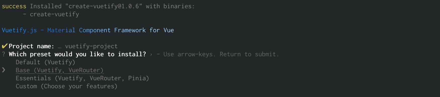
To begin, we’ll create a Vuetify 3 project from scratch in the terminal using the Vuetify project starter kit command for quickly spinning up an application.
yarn create vuetify

//OR

npm create vuetify
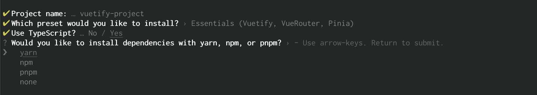
Next, we’ll name our project and then select a preset for it. We have several options here. Let’s go with “Essentials (Vuetify, VueRouter, Pina)”.
Next, we decide whether to use TypeScript and which package manager to use for installing dependencies. I’ll stick with yarn but you can use whichever you prefer.
You can also manually add Vuetify 3 by following the steps outlined here.
Migrating from Vuetify 2 to Vuetify 3
If you already have a project in Vuetify 2, upgrading to Vuetify 3 is straightforward. The guide is available on the official Vuetify website.
Breaking changes
It’s important to note that anyone upgrading from Vuetify 2 to Vuetify 3 will notice a few breaking changes, including:
valueprop has been replaced by model-value on components that supportv-modelusage.@inputevent has been replaced by@update:model-valueon components that supportv-modelusage.background-colorprop has been renamed tobg-color.v-simple-tablehas been renamed tov-table.v-tab-itemhas been removed, usev-window-iteminstead.- For v-btn,
active-classprop has been renamed toselected-class;depressedhas been renamed tovariant="flat";retain-focus-on-clickhas been removed; buttons use:focus-visibleinstead. - For v-checkbox, v-radio, and v-swtich,
on-iconandoff-iconprops have been renamed totrue-iconandfalse-icon
More information about the breaking changes can be found here.
Sample example Login form with Vuetify 3
Let’s build a simple example app to see how Vuetify 3 works. In this example, we will create a login form.
Create a header component
cd src/components
touch MyHeader.vue
In MyHeader.vue, paste this code.
<template>
  <v-app-bar app color="primary" class="px-10" dark>
    <div class="d-flex align-center">
      <h2>My Company</h2>
    </div>

    <v-spacer></v-spacer>

    <v-btn href="https://mycompany.com/contact-us" target="_blank" text>
      <span class="mr-2">Contact US</span>
      <v-icon>mdi-open-in-new</v-icon>
    </v-btn>
  </v-app-bar>
</template>

<script setup>
//
</script>
So what have we added in this component?
- The v-app-bar component. This offers a lot out of the box, most notably the app-like nav bar look and feel. It’s a container that can be used for navigation, branding, search, and actions.
- When you want to fill available space or make space between two components, you use v-spacer component.
- The v-btn component provide us with a button that has extra features such as ripple effects, higher elevations, easily prepending and appending icons, and much more. We can make
v-btnan anchor tag by using thehrefattribute. - The v-icon component includes a large number of icons for use in our application, as well as the ability to use them with two different themes (light and dark). Vuetify makes uses of the Material Design Icons. We’re specifically using the mdi-open-in-new icon.
Create a login form
Next, we’ll create a LoginForm component:
cd src/components
touch LoginForm.vue
And we’ll paste this code into our new LoginForm.vue
<template>
  <v-container class="pt-10">
    <v-form @submit.prevent="handleSubmit">
      <legend>Welcome back!</legend>
      <v-text-field v-model="form.username" label="Username" name="username" />
      <v-text-field
        v-model="form.password"
        label="Password"
        name="password"
        type="password"
      />
      <v-btn type="submit">Login</v-btn>
    </v-form>
  </v-container>
</template>

<script setup>
import { reactive } from "vue";

const form = reactive({
  username: "",
  password: "",
});

const handleSubmit = () => {
  // make api request
  console.log(form);
};
</script>

<style lang="scss" scoped>
</style>
Let’s walk through what we’ve just added:
- v-container provides the ability to center and horizontally pad content. It also has a fluid prop that allows us to fully extend the container across viewports.
- v-form allows us to easily add validations to all of our form inputs and hand submissions. We can also incorporate third-party validation libraries such as Vuelidate or Vee-validate.
- v-text-field provides an input field for collecting user data such as email address, home address, name, phone number, and so on. It also includes rich APIs that allow us to prepend and append icons, prefix and suffix, hint, add a placeholder, add clearable (a clear button that erases the input when clicked), on-the-fly validation without the use of an external library, and much more.
Note that we are using the composition API in the code above.
Update views/Home.vue
Next up, we’ll update our Home.vue to use Vuetify components.
<template>
  <v-responsive>
    <v-container fluid tag="section" aria-labelledby="title">
      <my-header />
      <v-main>
        <v-row>
          <v-col cols="4" offset="4">
            <login-form />
          </v-col>
        </v-row>
      </v-main>
    </v-container>
  </v-responsive>
</template>

<script setup>
import MyHeader from "@/components/MyHeader";
import LoginForm from "@/components/LoginForm.vue";
</script>
What’s going on here?
- We already covered the usage and need for
v-container. - Based on the Vuetify application layout system,
v-mainallows us to place our main content correctly giving the order of hierarchy. You can Read more about that. v-rowandv-colare components in the grid system that allow us to create rows and columns easily. They both provide robust and rich APIs that allow us to set the number of columns, offsets, breakpoints, order, gutters and much more. Read more here.
Running the Demo
Let’s run the demo by starting the server using the build command.
yarn serve
To see our work, we’ll open the browser to http://localhost:3000
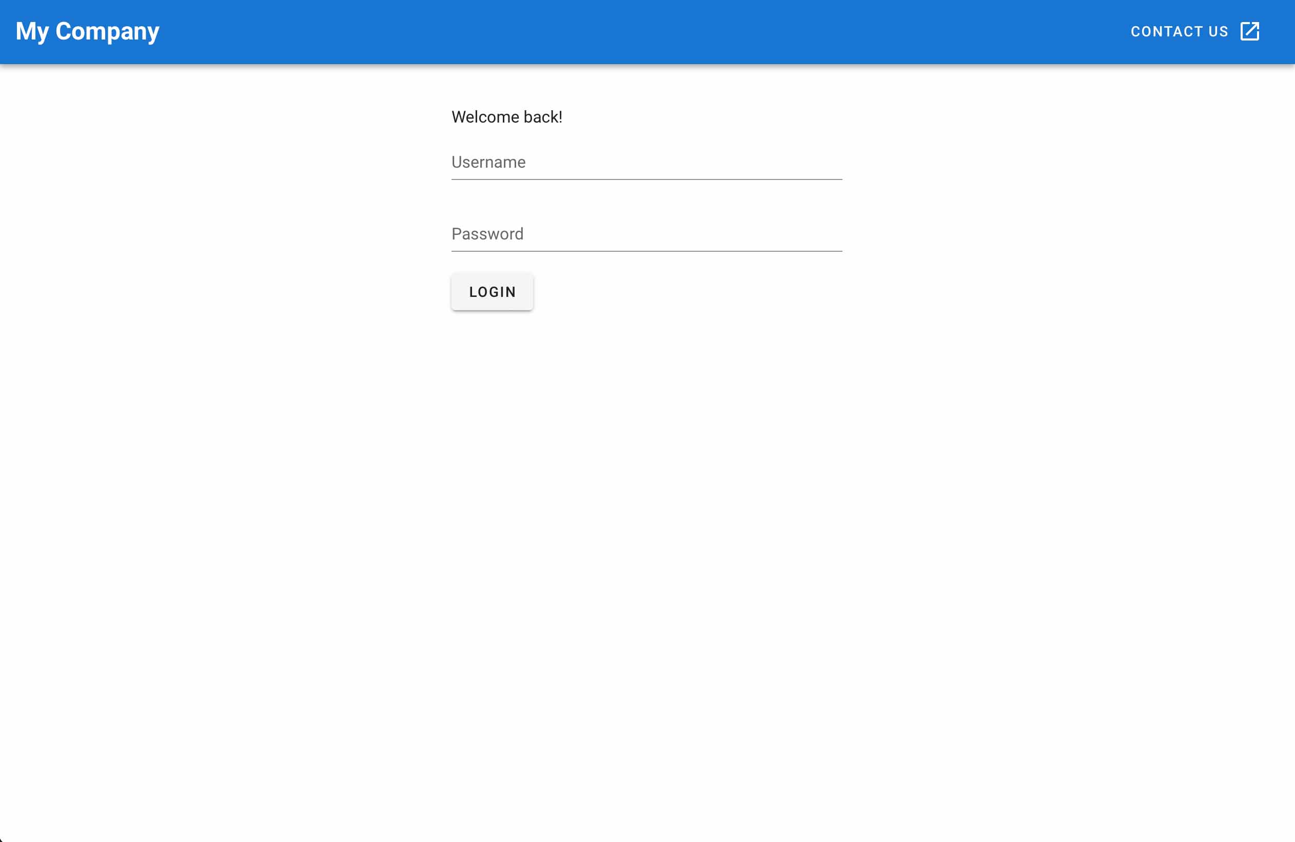
Voila! We can see our Vuetified interface:
Wrapping up
Vuetify 3 is the most popular UI component library in the Vue ecosystem, with hundreds of collaborators and over 36k Github stars. If you want to learn more about Vuetify, you can check out our “Beautify with Vuetify” course.