

The inclusion of dark color modes/themes has become quite common in modern web applications. Not only do dark modes look attractive on screen, but creating a dark mode/theme for your application can help improve readability, reduce eye strain, and even improve user experience.
In this article, we’ll be taking a look at how to add dark mode to a Vue application using the VueUse composable: useDark
The useDark Composable
useDark is a VueUse composable that provides a reactive dark mode that automatically persists inside session storage or local storage.
useDark first checks if there’s a value between session storage and local storage, and if there is none, it uses the system preference of the user.
Let’s go ahead and create an app that toggles between dark mode and light mode using useDark.
Project Setup
To get started, let’s create a simple Vue project with Vite.
Run the following command in your terminal:
yarn create vite vue-darkmode-app
# or with npm
npm create vite@latest vue-darkmode-app
Select Vue as your preferred framework, and install project dependencies in the project directory.
Install VueUse Library
Next, let’s make sure we have @vueuse/core installed in our project. We need this in order to use composables such as useDark and useToggle in our project.
Run the following command in your project’s root directory, in the terminal:
yarn add @vueuse/core
# or with npm
npm i @vueuse/core
Implementing Dark Mode
Now that we’re done with setting up, let’s go ahead and implement dark mode into our app.
Open up your App.vue file, delete the default starter code and import useDark
As earlier mentioned, useDark returns a reactive variable that checks the user’s session and local storage before resorting to the user’s system preferences for its value.
📁 src/App.vue
<script setup>
import { useDark } from "@vueuse/core";
const isDark = useDark();
</script>

<template>
  <p>Dark theme: {{isDark}}</p>
</template>
Run the server to view the app:

Whatever value is displayed on your screen at the moment is a result of your system preferences. The reason we’re seeing “false” in the screenshot above is because this system does not have a dark theme preference.
If you update your system preference to use a dark theme, the value of isDark would also update and “true” should display instead.
Now, let’s add a simple button that can toggle between light and dark mode. For this function, we’ll be using the VueUse composable useToggle, which takes in a boolean and switches its value.
Edit your App.vue file to look like this:
<script setup>
import { useDark, useToggle } from "@vueuse/core";

const isDark = useDark();
const toggleDark = useToggle(isDark);
</script>

<template>
  <p>Dark theme: {{isDark}}</p>

  <button @click="toggleDark()">
    Toggle Color Mode
  </button>

</template>
In this code, our useToggle function takes in isDark and changes its value every time our “Toggle Color Mode” button is clicked.
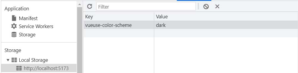
Now if you refresh your app, the value of isDark persists because useDark stores its value in the local storage.
Styling the app
You may have noticed that adding useDark to our app and toggling between color modes didn’t change our application’s appearance. That is because useDark only handles the DOM attribute changes and does not affect the actual style, theme or CSS for you.
However, useDark makes it easy for us to update our styles depending on what color mode is selected by adding a “dark” class to our HTML element every time isDark is true.
To confirm this, we can open up the DOM tree in dev tools and watch as the class is being applied or removed when you click the button.
Now let’s improve our app’s appearance by adding a different style for our dark mode.
Open up your App.vue file and edit the style:
<script setup>
import { useDark, useToggle } from "@vueuse/core";

const isDark = useDark();
const toggleDark = useToggle(isDark);
</script>

<template>
  <p>Dark theme: {{isDark}}</p>

  <button @click="toggleDark()">
    Toggle Color Mode
  </button>
</template>

<style>
.dark {
  background: #16171d; // it's better to use a dark grey color instead of pure black
  color: #fff;
}
</style>
Now that we’ve done that, let’s go back to our app and take a look.
Customizing useDark
Another great thing about useDark is that it is completely customizable. You can choose to specify the selector, attribute, and value of dark and light modes in your app using four different properties.
Update useDark to look like this:
const isDark = useDark({
  selector: "body", //element to add attribute to
  attribute: "theme", // attribute name
  valueDark: "custom-dark", // attribute value for dark mode
  valueLight: "custom-light", // attribute value for light mode
});
This means you’ll also need to update your styles to look like this:
<style>
[theme="custom-dark"] {
  background: #16171d;
  color: #fff;
}
</style>
Everything should still work the same as before.
If this configuration isn’t enough for you, and you need even more customization, you can hook the onChanged event directly to take full control over how you handle the updates.
Example:
const isDark = useDark({
  onChanged(dark) {
    // update the dom or store user's preferences in a DB by making an API call
  },
})
Where to go from here
As you can see, useDark makes it really easy to include a dark mode for your app. If you would like the option to select different color modes aside from just “light” and “dark”, check out useColorMode from VueUse as well.
VueUse has a great collection of composables that make things like switching color modes an effortless task. Our article by Michael Thiessen goes through a list of some of the best VueUse composables being used in the development of modern web applications today.
If you want to learn how to craft your own composables from scratch, check out our Coding Better Composables course!